
It’s fun to design a wedding invitation, but it’s all too easy to get caught up in the pretties—fonts, colors, textures, foil, flowers, and more. Of course, aesthetics are important (who doesn’t want an amazing invite?), but something else is more important: clarity.
Your invitation must still work. Guests should know precisely where they’re headed, when to arrive, what to wear, and what’s in store. If they can’t see the start time because it’s illegible in a script font or obscured under a watercolor design, you’ve got an issue.
Here are some pragmatic, no-frills tips to help you walk the tightrope between beauty and legibility so that your wedding invitation not only looks great but also works better.
1. Begin with the Basics Before the Fills
Get your content settled before you play around with layouts and swatches. What information do your guests absolutely have to know?
- Couple’s names
- Wedding time and date
- Location of ceremony (with complete address)
- Reception information (if different)
- RSVP info
- Dress code (if applicable)
- Wedding website (optional)
Design must do what the content does, not vice versa. When you have an idea of what text will be placed on the card, the design will come a lot easier.
2. Use Fonts That Are Aesthetic but Legible
Decorative fonts can be lovely, but if your guests cannot read them, they are causing more harm than good. Use decorative or script fonts minimally—perhaps on your names or headings—and keep the rest in clean, simple fonts.
Don’t use all caps in script faces, and avoid super thin or curly letters for important information such as the date or location. If in doubt, print up a trial version and ask somebody else to read it without context. If they squint or hesitate, it’s a no.
3. Use Only Two Fonts, Max
Too many fonts make a card look cluttered. Use one font for headers (such as names or section titles) and one for text bodies (such as details and RSVP information). The idea is to have contrast without confusion.
Using over two fonts can make the card look disjointed. Two fonts suffice to have hierarchy and style without overwhelming the design.
4. Make the Layout Clean and Organized
Good structure is what makes a lovely invitation, rather than a bewildering one. Employ a clear ranking:
- Names first
- Date and time second
- Venue and address third
- Reception or RSVP information last
Use line breaks and white space to divide sections. Do not pack it all into a single dense block. If you have more information than can be neatly accommodated, insert a second insert card or refer people to your wedding website.
White space is your best friend. It allows the design space to breathe and prevents everything from looking like a mess.
5. Select Colors That Won’t Sacrifice Legibility
Text light gray on cream-colored background may be stately in a mock-up, but in real life, it is not easy to read. The same can be said for text directly on busy floral backgrounds or watercolor textures.
Use a high-contrast color palette for wedding invitation cards. Black text on a white background or white text on a black background will always be clearer to read. If textured or patterned backgrounds are being used, there should at least be a solid overlay or box for the text.
6. Don’t Sacrifice Function for Style
Metallic foiling, blind embossing, vellum, and velvet texture for wedding invitation cards are all gorgeous design elements. But if they compromise legibility, dial them back. A wedding invitation is not a branding brochure. It must clearly communicate the specifics of your day.
Ask yourself: Would someone over 50 be able to read this with ease? Would someone who doesn’t know the venue get the directions? If not, simplify.
7. Proof Everything on Paper, Not Just Screens
Something that appears great on a computer screen will read much differently when off the press. Always print out a test card before ordering the quantity. Test for readability, margins, and the actual appearance of the colors on the paper before finalizing the wedding invitation card style and theme.
Test various lighting situations as well. A well-designed invitation in bright daylight may become illegible under soft light in a house if your color and font selections aren’t bold enough.
8. Use Inserts or a Wedding Website for Overflow Information
Don’t attempt to cram all the details onto your primary invitation. If you have other activities, travel information, registry information, or dress code descriptions, use an insert card or place the URL to your wedding website.
Attempting to say too much on one card results in small fonts and confusing layouts. Keep the invitation concise and allow the extras to reside elsewhere.
9. Be Clear About the Order of Events
Clarity becomes even more important if your wedding spans multiple days or involves ceremonies in different locations. Label everything clearly, especially if you’re sending one invite for all events.
Use section titles like “Ceremony,” “Reception,” or “Welcome Dinner” so people know what they’re being invited to and when.
10. Test It on Someone Who Knows Nothing
Before finalizing your design, hand the draft invite to someone who isn’t involved in your wedding planning. Ask them to read it and tell you:
- What is the wedding date
- Where it’s happening
- What time do guests need to be there
- What they should wear
- How to RSVP
If they can answer everything without asking questions, you’re good to go.
Final Thoughts
The ideal wedding invitation is not only good-looking but also provides your guests with all of the information they require in a manner that is clear to comprehend and pleasant to read. You don’t have to sacrifice clarity in favor of design. You simply need to be thoughtful about how you combine them.
Begin with good content. Frame a neat layout around it. Employ design to complement the message, not overwhelm it. And always, always test it out before sending it to print. Your invitation should reflect your day, albeit more so, it should ensure everyone arrives punctually and in the proper footwear.
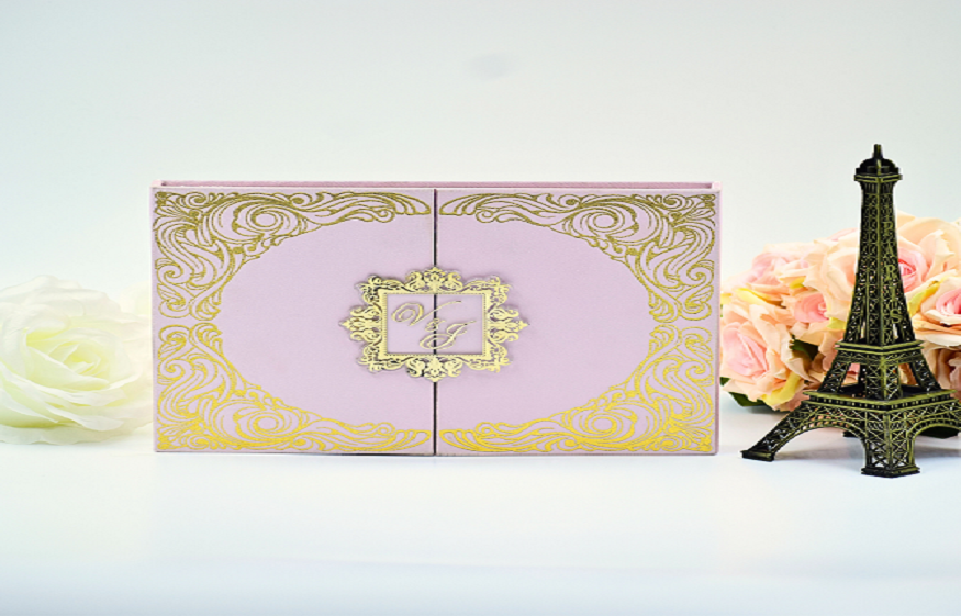
Trust Duallush to skip all this hassle. We can be your partners if you choose to order wedding cards online. And the best part is, they are here to make your vision a reality. Choose them for customization as well, and your perfect wedding invitation box will be in your hands in a day or two.